13 Green Kitchen Ideas for a Fresh and Eco-Friendly Look
“Green kitchen” is the decor trend everyone’s talking about—literally and figuratively. From sage paint to emerald stone, green surfaces bring calm, nature-inspired energy while still looking polished and modern.
Pair the hue with warm wood, textural tiles, or burnished metals, and the result is a timeless cook space that photographs beautifully and feels even better to live in.
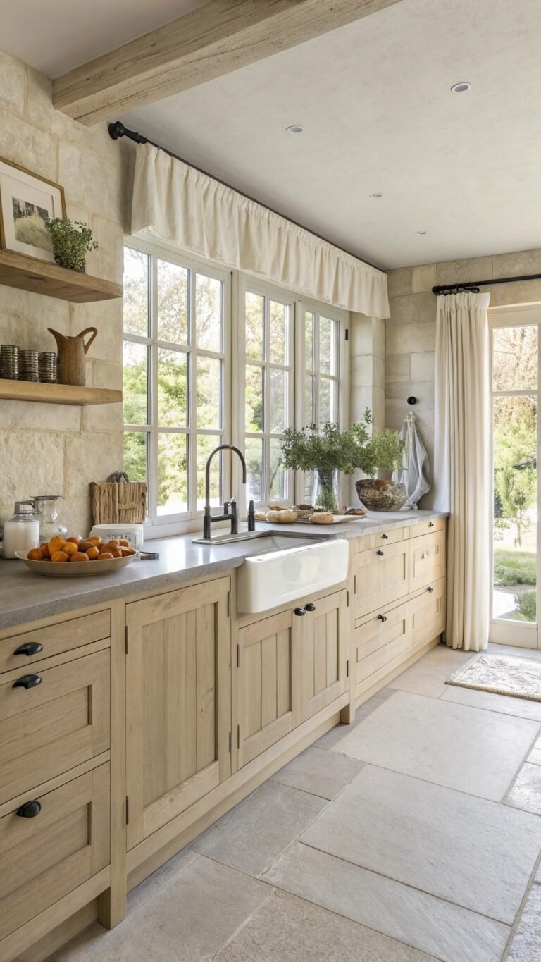
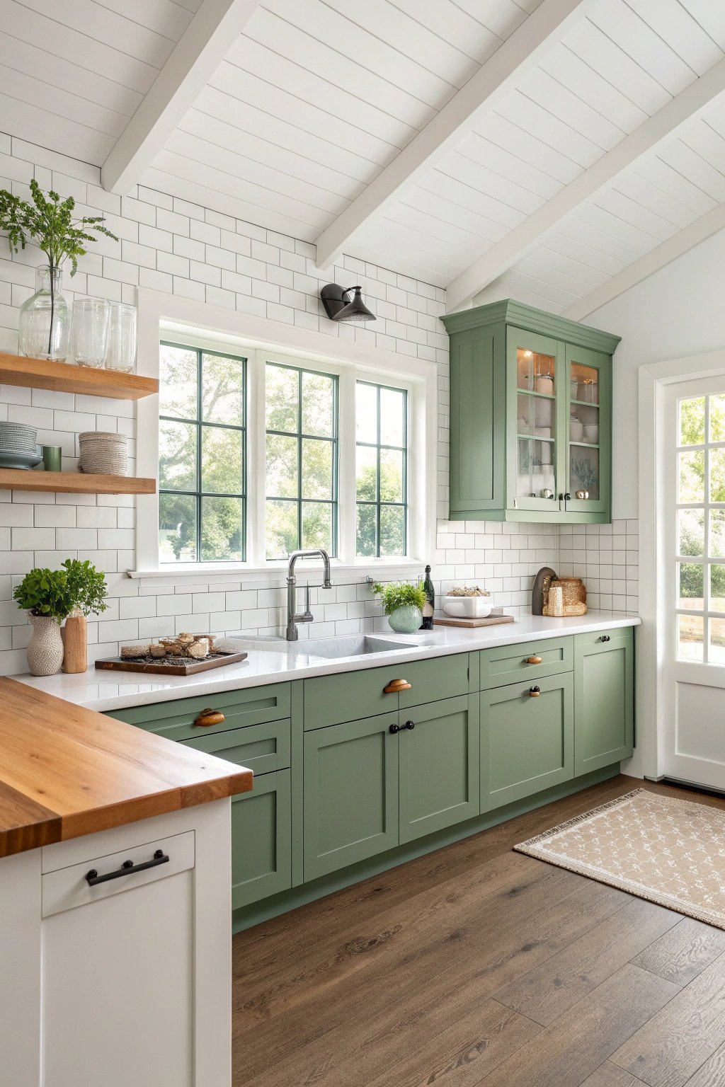
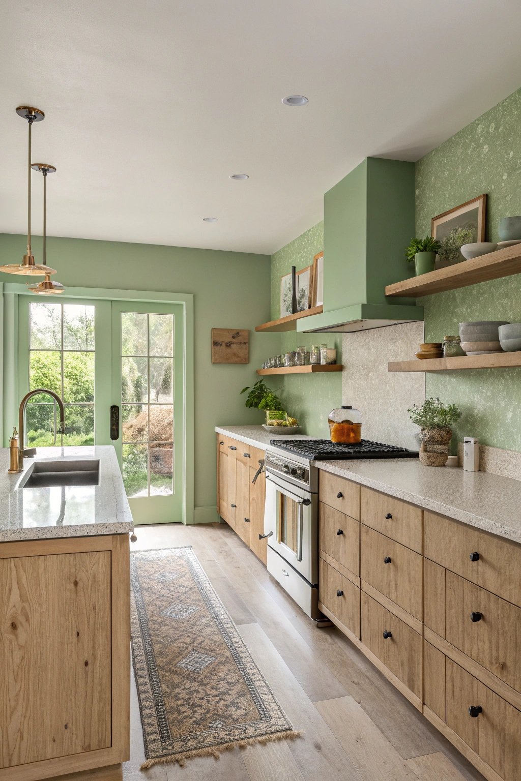
1) Sage Shaker Serenity
Soft sage on classic Shaker fronts instantly calms a busy cook space. The color reads as a neutral, playing nicely with creamy quartz counters, satin brass hardware, and light oak floors.
Open shelves near the range break up cabinetry massing, while a panel-ready dishwasher and counter-depth fridge keep the profile slim. Add a beadboard-lined pantry niche to layer cottage charm without sacrificing function.
What makes it unique
Sage is endlessly versatile: it shifts with daylight, appearing warm at sunrise and cool at noon, which makes the kitchen feel dynamic throughout the day.
Pairing sage with crisp white walls and frosted glass cabinet inserts adds airiness, while a slender brass gallery rail along the backsplash elevates everyday items into styled vignettes. The look balances tradition and modern practicality.
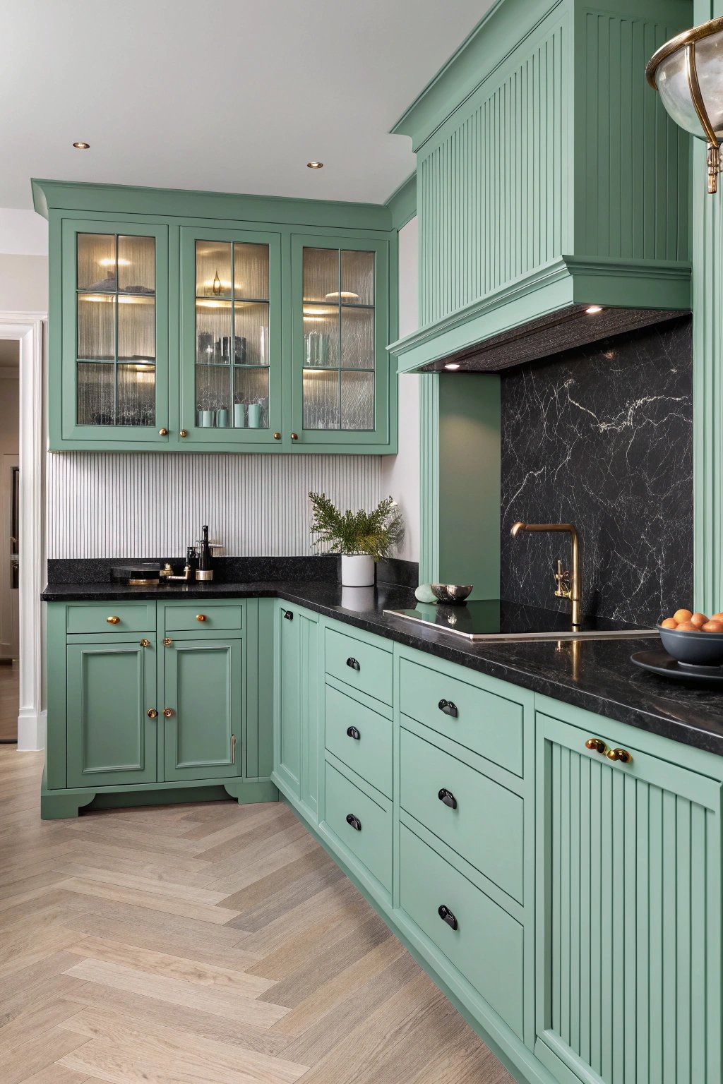
2) Emerald + Brass Luxe
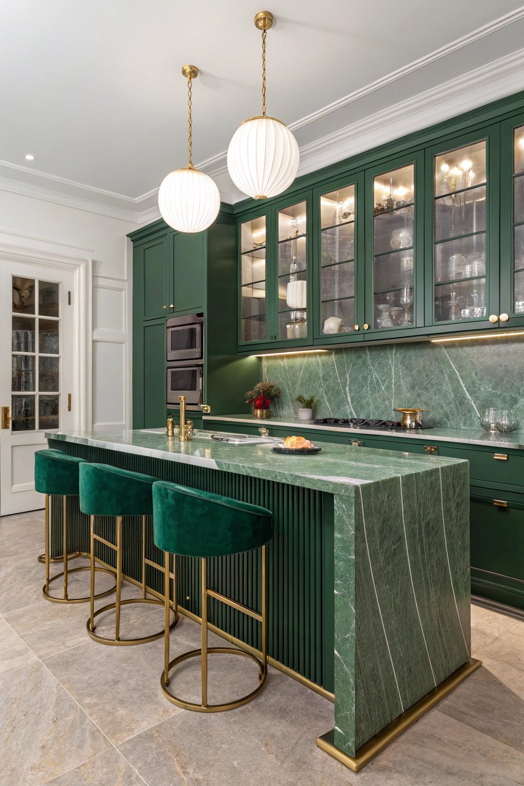
Deep emerald cabinetry turns the island into a statement piece. Book-matched marble with green veining echoes the palette, while unlacquered brass hardware and a fluted brass toe-kick add glam.
Tall glass-front cabinets display barware, and a brass pot filler frames the range. Velvet bar stools and ribbed globe pendants introduce subtle hotel-lobby energy.
What makes it unique
The secret is patina. Unlacquered brass ages gracefully, coordinating with emerald’s depth over time. A reeded glass hutch softens the intensity and bounces light back into the room.
Keeping ceilings white and integrating discreet LED strips beneath shelves prevents the palette from feeling heavy, letting the green read as luxurious rather than moody.
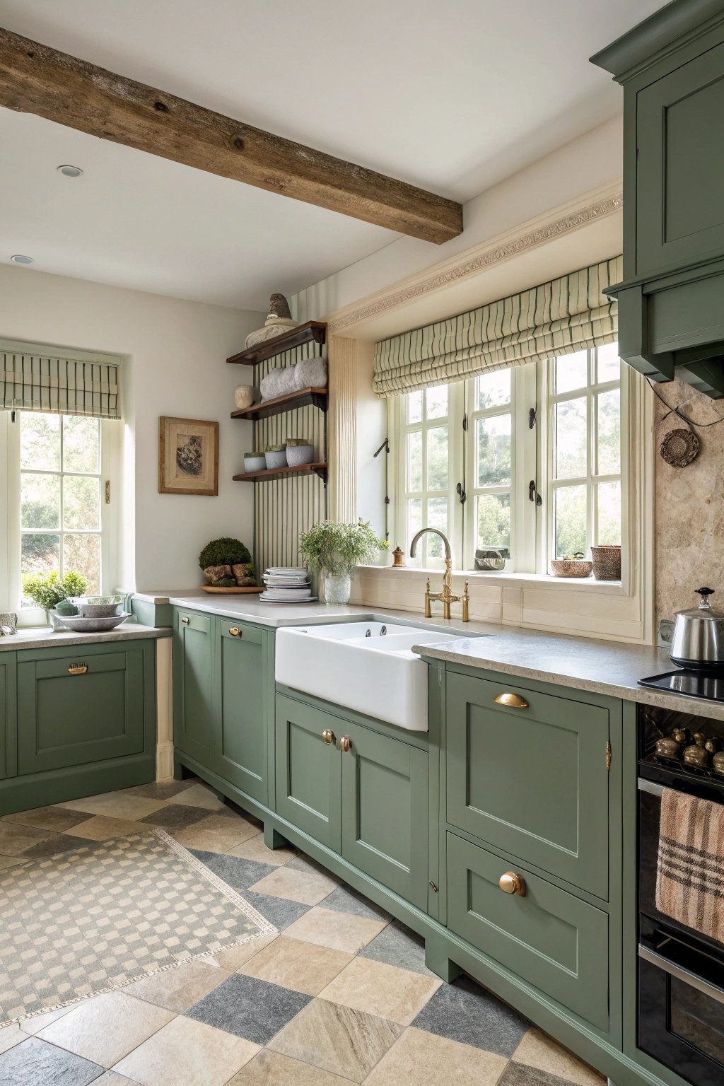
3) Olive Mediterranean Courtyard Style
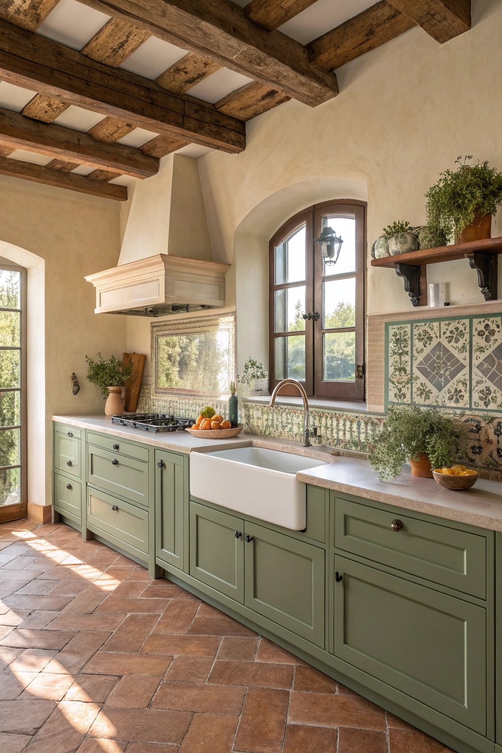
Olive green cabinets pair beautifully with terracotta floors and hand-painted tiles. A plastered hood with gentle curves softens lines, while open plate racks and rustic beams add countryside warmth.
A farmhouse sink in off-white fireclay contrasts with the cabinetry, and aged-bronze taps tie the palette together. Potted herbs on a sunny sill pull the outdoors in.
What makes it unique
Olive is earth-forward, so texture is everything: limewash walls, tumbled terracotta, and artisanal zellige provide variation that feels collected, not staged.
Using a pale, creamy grout warms the tilework, and a simple linen café curtain below the sink adds softness without visually crowding the base cabinets. The space feels like an inherited kitchen lovingly upgraded for daily life.
4) Mint Modern Minimal
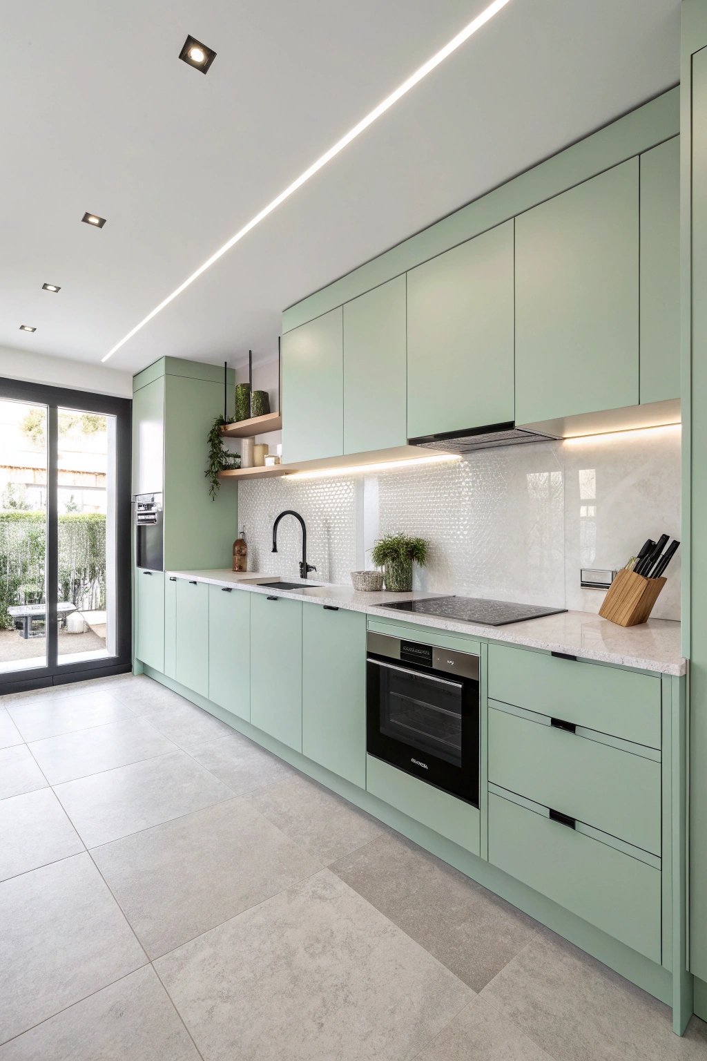
Mint reads fresh and contemporary on flat slab doors with integrated pulls. Pair with white quartz, a thin stainless worktop at the range, and a single open shelf for the essentials.
Large-format porcelain tile minimizes grout lines. A ceiling track with adjustable spots delivers flexible task lighting while keeping visual clutter low.
What makes it unique
The design hinges on restraint. Mint can skew playful, but balancing it with matte black accents—slim faucet, induction hob trim, and a framed art piece—keeps the palette crisp.
A flush-set ventilation hood and push-to-open pantry reinforce the clean planes, letting color carry the personality without extra ornamentation.
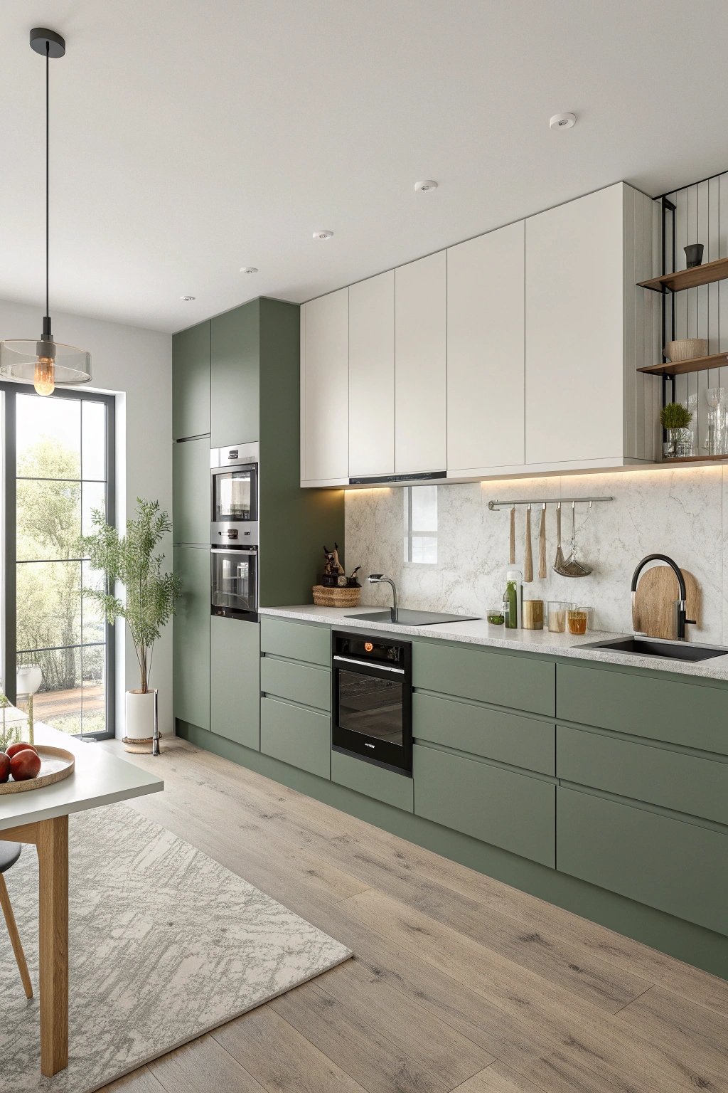
5) Forest Green + Natural Oak Warmth
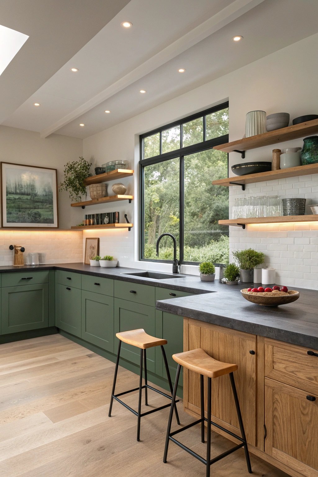
A rich forest tone grounds the lower cabinets while natural oak warms uppers, shelves, and stool legs. The combo feels organic and balanced, like a walk in the woods.
A honed soapstone counter adds touchable texture, and a long picture window over the sink frames greenery outside. Under-shelf LEDs create a soft evening glow.
What makes it unique
Contrast drives interest: darker bases hide scuffs in high-traffic zones while oak uppers keep sightlines light. Soapstone’s soft, velvety finish patinates beautifully, making the kitchen feel lived-in rather than precious.
Minimal black hardware and a slim black framed window repeat a subtle accent that ties the whole palette together without shouting.
6) Green Stone Statement Island
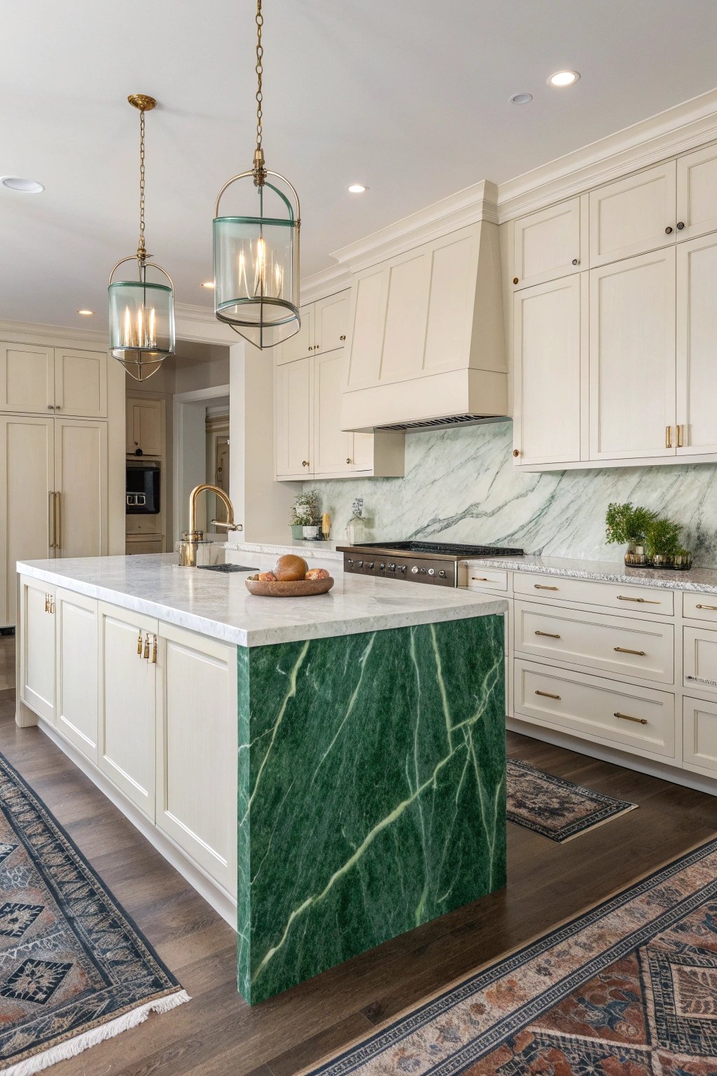
If you love drama, choose the stone as hero: a jade quartzite or green marble waterfall island under simple off-white cabinets. Keep hardware minimal and the backsplash quiet to let the veining shine.
A tall pantry wall conceals small appliances, and a concealed charging drawer keeps cords out of sight.
What makes it unique
The palette flips the script: neutral cabinetry recedes while stone becomes sculpture. Waterfall edges emphasize linearity, and under-island toe-kick lighting gives the slab a floating effect.
A micro-bevel on the stone edge prevents chipping without changing the clean look. The result is gallery-like but fully functional for daily cooking.
7) Two-Tone: White Uppers, Green Lowers
This classic split keeps the room bright while anchoring the base. Choose a mid-tone eucalyptus green for lower cabinets, white for uppers, and tie both with a continuous warm oak counter or a pale quartz.
A stacked tile backsplash to the ceiling adds verticality, and a semi-flush globe fixture balances the layout.
What makes it unique
The “weight down low, light up high” approach suits apartments and compact homes. Painting the window trim the same green as lowers subtly frames the view and makes the palette intentional.
A matching green kickboard and painted vent cover avoid visual breaks near the floor, making the cabinetry look custom and cohesive.
8) Cottagecore Pistachio + Butcher Block
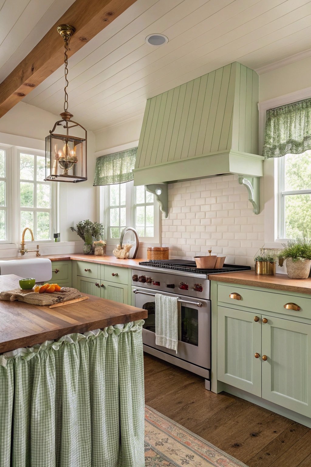
Pistachio paint and oiled maple tops create a soft, nostalgic mood. A freestanding range with a curved backguard, scalloped toe-kicks, and vintage-style latches reinforce the charm.
Display copper pots on a small rail and line drawers with ticking stripe. A floral fabric skirt under the prep sink adds sweetness and texture.
What makes it unique
Cottagecore works best when finishes feel hand-touched. Oiled wood tops develop character, and small imperfections add authenticity. Choosing a soft matte sheen on paint prevents glare and keeps the palette gentle.
Mixing in a single antique—like a glass-front pie safe—elevates the story and offers vertical display without installing more wall cabinets.
9) Scandinavian Moss Matte + Handleless
Mossy matte fronts with J-pull or push-to-open hardware deliver a hushed, tactile minimalism. Pale oak floors, a thin-edge white composite counter, and a low-profile induction top keep lines spare.
A wall of tall cabinets hides pantry, ovens, and fridge for a calm, uninterrupted façade. Add a single ceramic pendant for gentle focus.
What makes it unique
Texture takes the lead. Super-matte anti-fingerprint laminates keep surfaces pristine, while micro-shadow reveals at door gaps add subtle depth. A floating shelf in pale ash provides just enough display without breaking the serene planes.
Understated doesn’t mean cold—warm LED temperature (2700–3000K) ensures the green stays soothing instead of gray.
10) Biophilic Herb Wall Kitchen
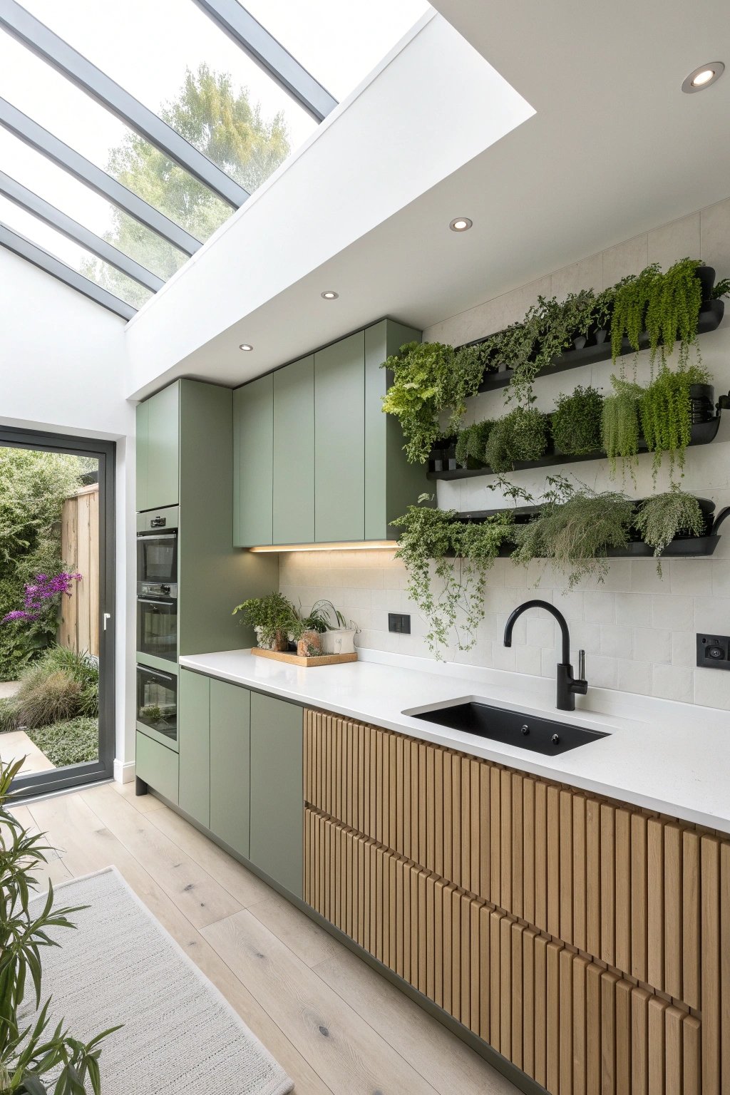
Lean into “green” literally with a living herb wall near the prep zone. Choose a mid-green cabinet color that harmonizes with plant tones, and keep counters in white quartz to bounce light onto foliage.
A floor-to-ceiling window or skylight ensures growth, while a concealed irrigation tray simplifies maintenance. The result is fresh, fragrant, and functional.
What makes it unique
Biophilic design improves both mood and cooking. Group herbs by water needs on modular rails and add grow-light strips tuned to daylight temperature to prevent purple cast.
A slatted oak backing lets the wall breathe and becomes a feature even when plants are trimmed back. Everything stays within arm’s reach for snipping basil mid-recipe.
11) Eco-Friendly & Upcycled Green
Sustainability meets style: VOC-free green paint on FSC-certified plywood boxes, recycled-glass terrazzo counters, and reclaimed oak shelves.
Vintage pulls get a polish and new screws, while salvaged doors become a sliding pantry front. A high-efficiency induction range and ENERGY STAR appliances cut utility use without compromising power or speed.
What makes it unique
The narrative matters. Every material tells a story, and subtle tone variation—especially in terrazzo—adds depth that mass-market surfaces lack.
Exposing a sealed plywood edge at an open cubby communicates honesty of construction. Documenting sources on a small framed tag inside the pantry celebrates the project’s eco credentials and makes guests smile.
12) Art Deco Teal with Fluted Details
A saturated teal leans retro glam when paired with fluted drawer fronts, ribbed glass, and curved corner cabinets.
Black marble with pale green veining sets the mood, while a stepped crown around the hood nods to Deco architecture. Polished nickel hardware and a black-and-white runner finish the look.
What makes it unique
Deco is about geometry and repetition. Flutes on the island echo vertical ribbing on the glass doors, and a stepped profile repeats in the toe-kick and hood.
Teal keeps it current, avoiding theme-park nostalgia. A mirrored backsplash panel behind a bar niche adds sparkle and expands perceived depth without overwhelming with reflection.
13) English Country Hunter Green + Checkerboard
Hunter green cabinetry feels cozy and storied with inset doors, furniture-style feet, and a plate rack over the sink. A cream-and-charcoal checkerboard floor adds country gravitas.
A range cooker with a narrow mantel shelf and brass rail invites display, while tongue-and-groove paneling wraps the room in texture.
What makes it unique
Details count: inset hinges, turned island legs, and a small spice drawer bank make the joinery feel bespoke. Checkerboard in honed stone keeps glare down and ages gracefully.
A roman blind in ticking stripe or subtle floral ties the palette to soft furnishings, ensuring the space feels layered and lived-in from day one.
Pro Tips for Any Green Kitchen
• Test paint samples in different lighting; greens shift dramatically from dawn to dusk.
• Keep a consistent undertone (warm vs. cool) across paint, tile, and stone.
• Balance color with texture—matte finishes and natural materials prevent the scheme from feeling flat.
• Repeat metal finishes in at least three places for cohesion.
• Use layered lighting (task, ambient, accent) to keep green hues flattering and photo-ready.